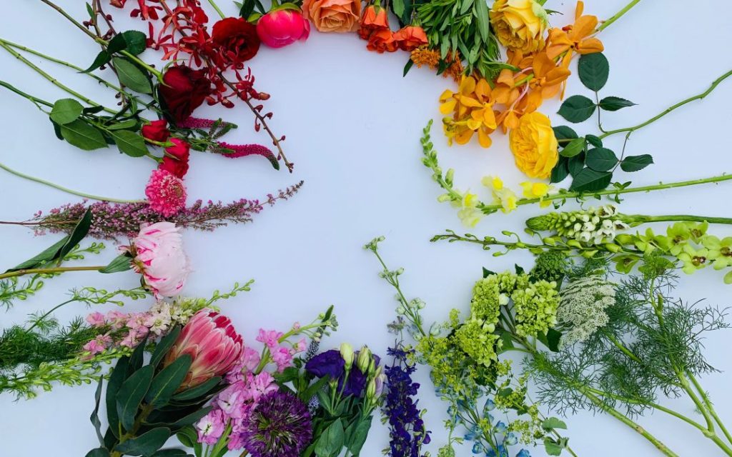
Colour plays an integral role in landscaping design. The colours chosen for plants, hardscaping and other accessories will lend a specific mood to the space. What that mood is is up to you. But how to achieve that mood is largely dictated by your use of colour. In order to help you learn how to evaluate colour in landscaping design projects, we’ve put together this short primer.
The Colour Wheel
The colour wheel plays a fundamental role in how colours are perceived by the human eye. It reveals relationships between colours and provides a designer with a structural framework from which to make decisions regarding colour placement. Colours that are found on opposing sides of the colour wheel are known as complementary. An example would be the colour pair of red and green. Colours found adjacent to one another on the colour wheel are known as analogous colours. An example of that would be the colour pair of orange and yellow. By using these relationships between colours to guide the choices and placements of various landscape elements it’s possible to create specific moods and atmospheres in the area.
Complementary Colours
Complementary colours create a bold and bright dynamic. The broad contrast between complementary colours is exciting to the eye while still keeping things balanced. Using complementary colours in landscaping design generates a stimulating environment that makes good use of the intensity of opposites.
Analogous Colours
Analogous colours, on the other hand, create a sense of fluidity and unity. Moving from one colour to another becomes a smooth transition rather than large jumps in contrast. Using analogous colours is ideal for creating a serene and calming ambience. Nature tends to make use of analogous colour schemes more often than complementary colours. So, for a more natural setting, try pairing analogous colours.
Colour Temperatures
Certain colours, such as red, yellow and orange are considered hot. Other colours, such as blue, green and pink are considered cool. You can use these relationships to alter, match or contrast to the overall mood of the space. Hot colours used in grey, rainy environments can provide some much needed warmth. Cool colours can be used to make a space appear larger. Mixing hot and cool colours is also an effective way to create depth and enlarge the area.
