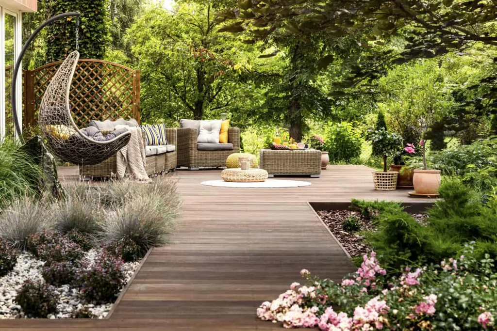
Great landscaping depends on only a handful of simple components. By understanding how these components are used and how they interact with one another, it’s possible to simplify the process of making your landscape look appealing. We’ve put together a list of the top five components of landscaping.
Line
Line is used to draw the eye from one place to another. It creates a sense of flow and physical connectedness. Horizontal lines draw the eye across the landscape and provide a sense of breadth whereas vertical lines draw the eye upward and help create more headroom. Lines can be straight, curved or uneven depending on the desired result. Fences, hedges, pathways and bordering are commonly used to create lines.
Mass
Mass gives a sense of size depending on the objects that occupy the space. Mass and space are often used to counterbalance one another. Objects, and therefore mass, also need to counterbalance each other. When it comes to mass, size and placement in relation to the surrounding environment is key to creating a coordinated landscape.
Form
Form is the structure, configuration and contours of the objects that occupy the space. Different shapes or forms create different feelings. Form can be used to impose a specific atmosphere on a space such as calm, levity, boldness, or strength. For example, sharp corners and straight lines evoke structure and stability whereas curves and circles are more likely to create a sense of calm and tranquility.
Colour
The use of colours and how they interact is another important way to create a specific mood or atmosphere in a landscape. Colours can be used for contrast or unity depending on where they sit on the colour wheel. Some colours are considered cool, whereas others can be warming. Neutral colours can be used to lessen the effects of other colours, or create a distinct atmosphere of their own.
Texture
Texture refers to the form and shape of a landscaping element in relation to the shapes and forms of elements surrounding it. Textures run along a gradient from coarse to medium to fine. Placing different types of textures adjacent to each other prevent the perception of monotony and repetitiveness.
